Request Type: NEW FEATURE MCEBuddy Version and Type (32bit or 64bit): 2.5.8 x64 - 20230306 Operating System and Type (32bit or 64bit): Win10 22H2 x64 Summary of the problem or suggestion:
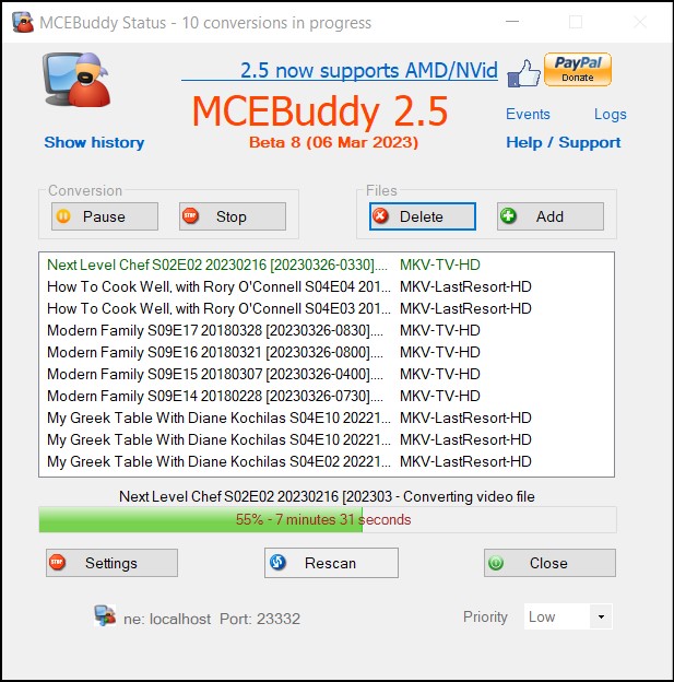
The main UI panel for the “conversions in progress” table allocates too much space to the profile.
It might be helpful to calculate the max length of all profile labels and use that in setting the UI initial column sizes, and maximize the proportion allocated to the task filenames.
A “nice to have” would be a column separator handle for user-adjustable column sizing.
More space could be allocated to the display area (e.g. the side and bottom border areas reduced to the same size as the top thin gray border area between the icons and the window title bar). The line spacing could be squeezed a little bit 1 or 2 less pixels. And switching to a monospace font will help with fixed-size filenames and column width calculations (integer character widths + padding/spacing/separator lines).
A “nice to have” would be a sorting option (e.g. click on the column heading and display an “^” or “v”) . There might need to be a new column to display the task order (default, and also sized by max # of digits in current task count) if users sort by filename or profile.
Steps to replicate the bug: Open MCEBuddy UI (User Interface)
This was intentionally disabled because it’s misleading. The order you see here is the order in which the files will be processed and you can re-order the queue by dragging files up/down. If you click on the sorting column then everything will be out of order, i.e. what you see won’t be what is processed.
That’s why I suggested adding a “processing order” column to make that completely clear at all times. The “drag and drop” re-ordering could be disabled whenever the sort order is not the default “processing order” (with a popup hint explaining why that action is being blocked and to suggest the user sort by processing order to re-arrange the order).
I suggested it due to several differences in my workflow from yours. 1) I don’t have/use FileBot. 2) I stop MCEBuddy when the video card is being used for something else (gaming and Plex, which might kick off its own transcoding for a client player) as this is on a multi-purpose PC which is also my recording engine.
So I end up with a big list of files in the queue. I get that I’m not changing the processing order, hence the added column to display the position in the list.
I want to sort by filename because I’m getting the same file triggering tasks under multiple profiles. My profiles are based on the channel the show was recorded on to basically switch between SD and HD profiles and movie/series. When that’s not present, or my logic isn’t right, the same file it will get processed multiple times when it doesn’t need to. Sometimes the same show will be broadcast on different channels and resolutions (PBS and Create cooking shows mostly, but also shows in syndication).
When sorting by filename, I see tha same file side by side with the other profiles and can delete the one that doesn’t apply. As well as the same episode broadcast at multiple times (I include the air time in my filename).
Lastly, if it does make it into MCEBuddy, you don’t have to use it if you don’t need it.
My main request and need wasn’t to sort the order or have a drag’n’drop feature.
The point of this post was to provide more room for information on the UI and less room for unnecessary wasted blank space that truncates and prevents actual information from being displayed.
Like the “…” in the filenames and the blank area to the right of the profile names. Completely unnecessary and tweaking the layout as I described would address that issue in the UI.
The sorting stuff was clearly noted as “nice to have”. Let’s not get distracted with unrelated issues like how MCEBuddy monitors folders for changes in deciding what to add to the task list. Start another thread for that if you have some suggestions.