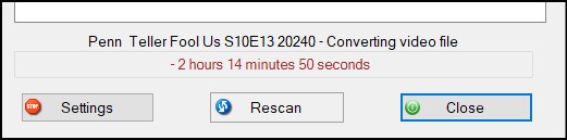
MCEBuddy Version: 2.6.3 Operating System: Win10x64 22H2 19045.4046 Summary of the suggestion: Reduce margins on processing status message Screenshots:
The default space / margin reserved around the status message should be reduced to allow more of the filename to be displayed without truncation or requiring the user to expand the window to see the whole filename being processed.
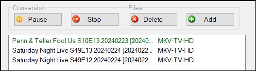
Also, the proportion between the filename and profile columns should be adjusted to not reserve so much space when profile names are far shorter. Since all configured profile names are known, the maximum length can be calculated and adjust the proportion of the conversion queue list columns accordingly.
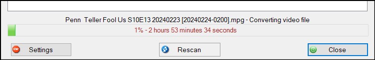
These have been added in today’s 2.6.3 beta build.
Pop up description for filename name on current task if the name is too long, optimize the width as much as possible - note with DPI scaling there are differences do it may always use 100% of the width
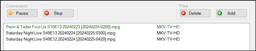
Dynamic auto sizing of column width for the conversion queue and also the monitor locations and conversion tasks
Thanks @Goose. Even if it is roughly better than it was, that is still a win.
i.e. a 2% margin would be better than what looked like a 20% margin on each side.
And for the task list, I would rather truncate the profile name than the filename being processed, as that is typically the more important piece of information between the two.
Thanks for considering this and making it happen so fast!